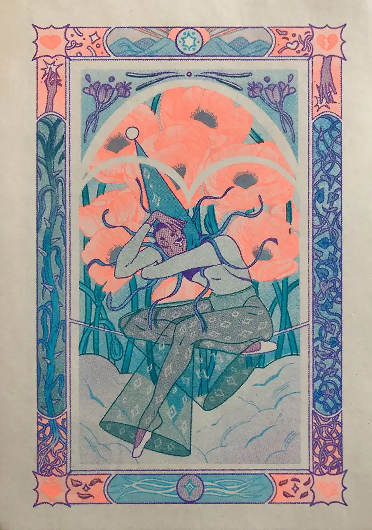
A while back, I was asked by Sabrena Khadija to participate in Riso Club, a monthly print subscription by Risotto Studio that highlights 4 artists from different locations. We decided on a 3 color palette together and then had creative freedom to draw whatever we wanted. At the time, I was really struck by compositions that showed stories in the panels of the border around the artwork itself. There was something fantastical about the approach, and I had never created a composition like it before, so I tried it out for the print.
I knew I wanted the focus of the illustration to be this jester figure surrounded by flowers in the middle, but I wasn’t too sure about the borders. In the rough sketch stage, I thought about ways I could tie the outer areas of the illustration back to the center. This is when I considered elements I enjoy depicting in my artwork: entanglement, hands, stars, and energy. And to balance everything out, I chose to have the colors mirror on either side of the artwork. Even though the elements in those areas were not entirely the same, the color balance allowed them to compliment one another seamlessly. And I was able to think about different approaches to color in each of those spaces.
When I’m working in risograph, I always start thinking about the overlapping color combinations I can get from my palette. I try to have fun with the process! Even with a limited palette, because riso inks have a translucent quality, there is potential for a great multitude of color creation from a small number of colors. These limitations also encourage you to think about how you utilize the page, both compositionally and in the literal sense. The color of your paper can add another layer of depth for your print. There are little moments in the artwork where the color of the page shows through: the pattern of the pants, in the eyes, through the stars, and in the window-like effect framing the figure for the viewer. I took a risk by having the arches cut into the artwork, but it ended up complimenting the movement on the edges of the composition and created a dimensionality I liked!