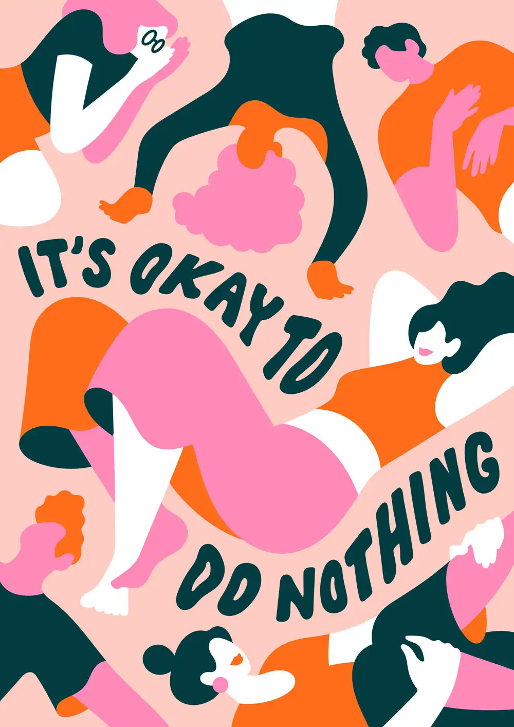
After several weeks of the Covid-19 lockdown, this sentence appeared in my head. I have observed so many people on Instagram who got extremely productive and started several new projects – myself not excluded. I still had to continue working as normal, but I also wanted to join in, start some new projects as well, be productive, just do something, maybe to compensate what you actually couldn’t do now. So in addition to my regular work as a freelancer, I then created personal illustrations, cleaned my apartment, baked cakes and did other things that I had not come to before. It’s not a bad thing, everyone copes differently with a crisis, but I realized that I don’t have to do it. It is perfectly okay to do nothing. Just lying around and watching TV maybe. I think that my self-made to-do list was a way to distract myself from the fact that the world now runs a little slower and differently to before. I felt guilty when I didn’t do anything because, you know, things have to be done. I often measure my mood by how productive I have been. But it is important to know that you are just as important and that you can be happy when you are not productive. It is healthy to simply do nothing and let things run their own course. I have to remind myself again every day.
So this sentence came into my head and it was the perfect moment to try hand lettering. I always wanted to combine type and illustration. I sat down, having my freelance work already finished, and thought about what to do next (just to be productive, it is a bit of a contradiction to my own principle here). I scribbled down the sentence and thought it would be perfect to add a few figures. People are my most favourite thing to draw, so it was only natural that I came up with several figures that just don’t do anything, they just hang out and lie around. I also love to nest elements into each other, that gives an exciting dynamic. Then I adapted the text to the movement of the figures. Usually, I always make a sketch in Procreate, pretty detailed, and then export it to Adobe Illustrator. There, I simply draw the contours and color the shapes. I choose colors very intuitively. I have a few colors that I like a lot and that I often use. At the moment I love the combination of pink and orange, for this piece, it was a perfect match because it gives the illustration a positive appearance and hopefully conveys a good mood.


